


Over the last year and a half, I've designed several versions of this portfolio. It might seem unusual to include the making of your own portfolio as a case study, but I think the process of getting here says more about my growth as a designer than any single project does. Having said that, I'm fairly certain that in a year's time I'll look back at this version and find a hundred things to change. But that's a problem for future me!
Version 1

My first portfolio was clean, minimal, and completely forgettable. I used a template and changed little beyond swapping in my own content.
And it showed!
While it technically displayed my work, it could have belonged to anyone. A viewer could go through it in full and still come away knowing nothing about me as a designer or a person. At that stage, I treated a portfolio as a record of what I'd done as opposed to a reflection of who I was.
Version 2
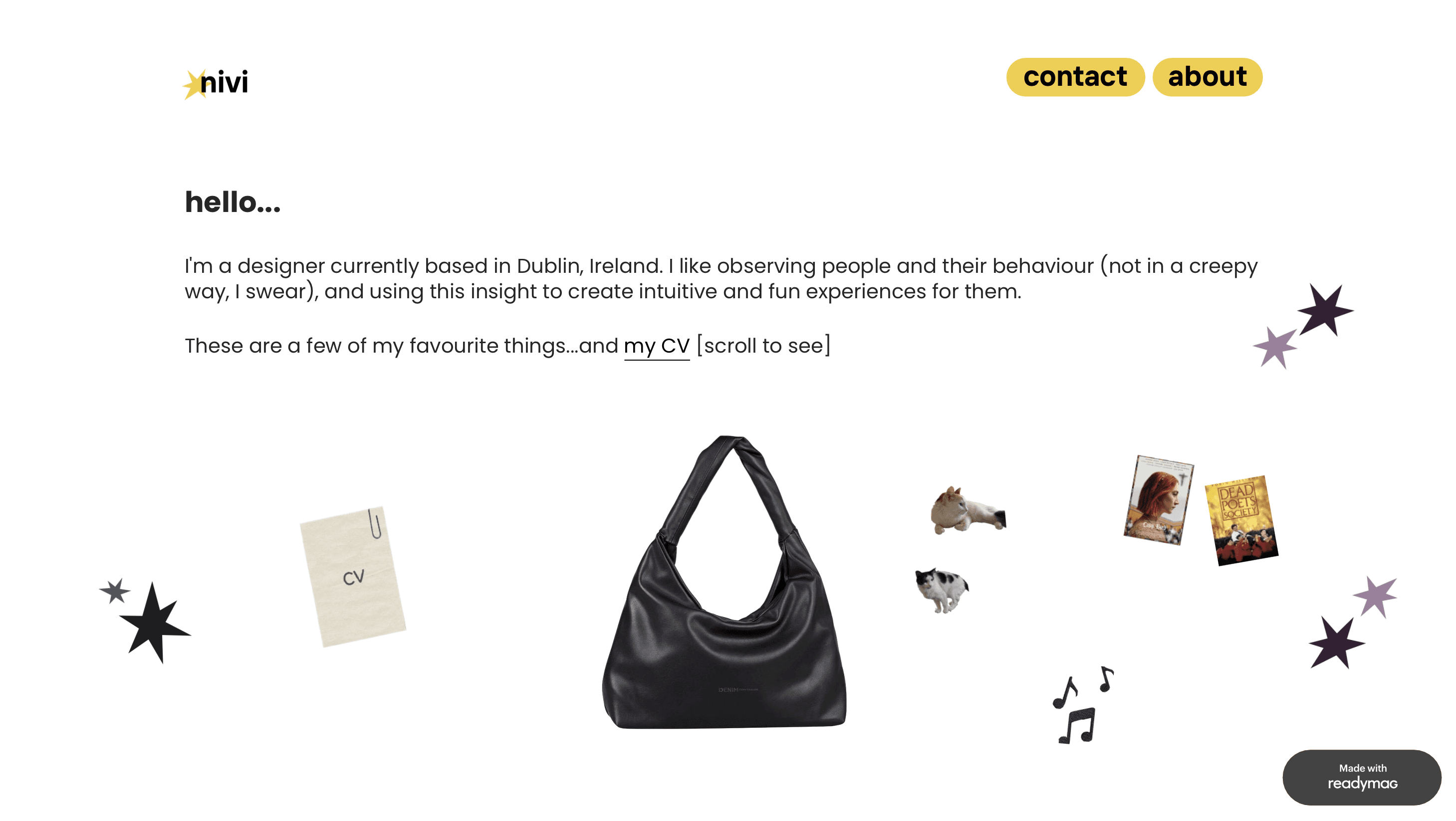
The second version was bold and visually striking, but it lacked warmth, and felt more like a brand identity than a personal portfolio. I prioritised visual differentiation at the expense of functionality.
Project titles didn't communicate enough context, forcing users to click into each one blind. It was also poorly responsive, with layout inconsistencies across devices.
I shared both versions over time with friends, family, and UX mentors. Most people responded to Version 2 from a purely visual standpoint. But those with a UX background - thinking like hiring managers - consistently flagged the same issue: it might be memorable, but it doesn't highlight the work.
This version is an attempt to hold two things at once: a distinct visual identity that also genuinely sounds like me.
I picked colours and created little graphics that I felt added personality but did not distract from the actual work.
My design choices were made keeping in mind the core user group: potential recruiters. Considering the fact that most people will not spend more than a few minutes skimming through the website, I wanted to ensure that there was enough information available at first glance for a user to decide if they would like to know more about something on the page.

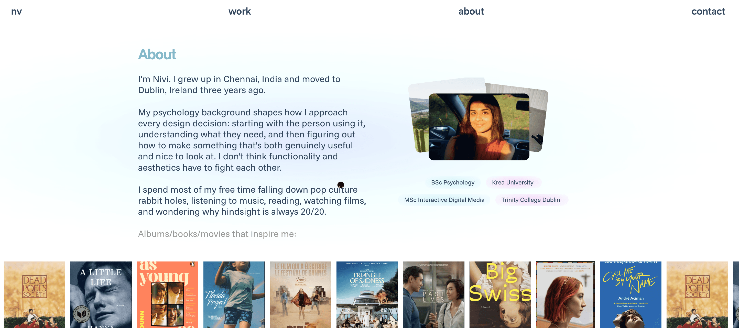
The About section is in the homepage so that you quickly learn a little bit about who I am instead of having to navigate to a separate page for this information.
The cursor turns into a bee when you enter the footer because I found out that I could make a bee in Figma, import it into Framer, and use it as a custom cursor. That's the only reason!
Responsiveness should always be a priority: Responsiveness does not seem unattainable and like an afterthought once you understand basic concepts like auto-layout, stacks, frames, constraints etc.
A portfolio is supposed to tell a story: After looking through tons of portfolios for inspiration, I’ve realised the ones that stand out the most are those that feel like there’s a human being behind them.
Scalability matters: I moved away from ad hoc styling and built out a proper system with text and colour styles, components, variants, and templates. Now, when I have new work to add, I won’t be starting from scratch.


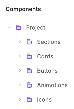
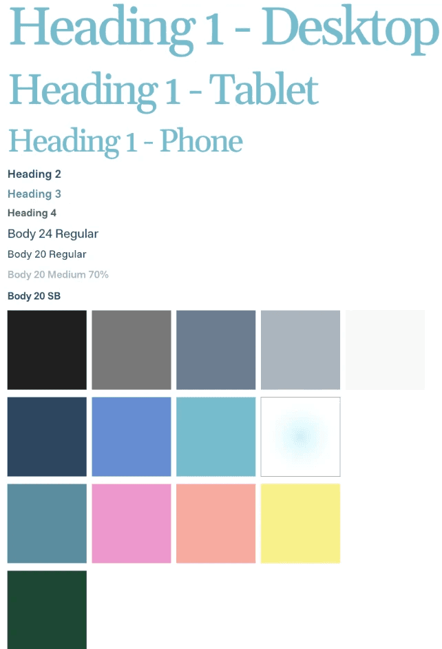
My mini design system
This portfolio will certainly keep evolving. But for now, it's a pretty good reflection of who I am as a designer and I think that's a good place to start!