Redesigning the MployChek Candidate Flow
MployChek is a pioneering company using blockchain technology to transform background verification. As part of the UX team, I was responsible for redesigning one of the most important touchpoints in the product: the self-initiated candidate flow, which is the process users follow when they independently seek credential verification for employment or education.


The Problem
The previous website used a single, generic flow for all candidates, whether they were self-initiated or directed by a recruiter.
User feedback revealed that this one-size-fits-all approach was confusing and frustrating, leading to a high drop-off rate among users.
The experience simply didn’t reflect the needs of people navigating the process on their own.
My Solution
I redesigned the self-initiated candidate flow to make it clear, intuitive, and aligned with evolving business requirements.
The new experience:
✽ Guides users step-by-step through the verification process
✽ Sets expectations upfront (in this case, payment)
✽ Reduces unnecessary friction and decision points
✽ Provides clearer feedback and acknowledgement
The Psychology Behind It
Background verification is, by nature, a high-stakes process. The people going through it are doing so because something important - a job, an educational opportunity - depends on the outcome. That context matters, because it means that every moment of confusion or uncertainty in the flow carries a disproportionate emotional weight.
The research reflected this clearly: a clunky interface frustrated user, yes, but also made them anxious. Designing for this experience meant keeping in mind emotional reassurance as much as task completion.
The Process: Research and Exploration
User Interviews
I conducted two moderated sessions over Zoom where participants navigated the old flow while screen-sharing and thinking aloud. I took note of their pain points and frustrations in detail in this Google Doc.


Key findings:
✽ Users were slowed down by misleading section headings and unclear buttons
✽ The lack of confirmation or acknowledgement made the process feel unreliable
✽ The experience often left them feeling confused, frustrated, and even anxious
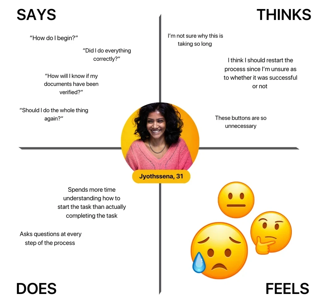
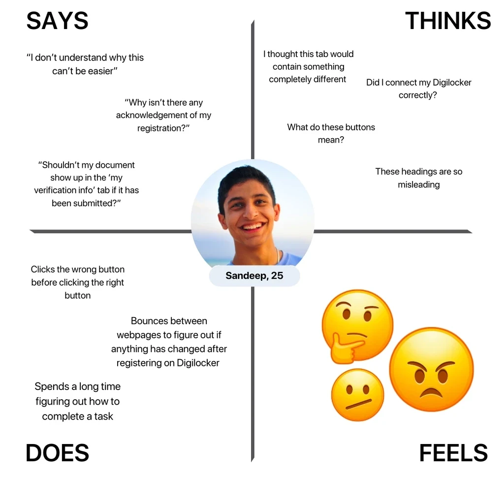
This research helped me map the users' emotional journey and identify where the flow was breaking down.
Empathy Mapping
I created two empathy maps that summarized what users were thinking, feeling, saying, and doing throughout the experience. This reinforced the importance of clarity, guidance, and emotional reassurance in the redesign
Design considerations
Following a review session with the project manager, we aligned on three core design requirements:
Introduce a payment step: Self-initiated candidates would now be charged for verification, so payment needed to be clearly incorporated.
Maintain brand consistency: The new flow had to follow existing visual guidelines (fonts, colors, tone) to stay aligned with the recruiter-initiated experience.
Make the process simpler and more intuitive: Reducing confusion would not only improve user experience but also decrease the load on customer support.
User Flows
I first mapped a high-level flow in Figma outlining the end-to-end process starting from the MployChek web app (note: I wasn’t involved in designing the web app).

The following diagram shows the broad steps the user will have to follow once they have finished submitting their documents and are waiting for the verification process to be complete.

Iterating on the flow
Because MployChek is an early-stage startup, the business requirements evolved rapidly. I produced multiple iterations of the user flow based on feedback from stakeholders as goals became clearer.


The Process: Research and Exploration
Wireframing
The following wireframes show the iterative process: after receiving feedback from my colleagues, I refined the low and medium fidelity wireframes.
Initial Design #1
✽ Overlays that required unnecessary clicks
✽ Payment placed at the end of the flow, leading to drop-off due to perceived lack of transparency
✽ No flexibility for users to customize their verification bundle
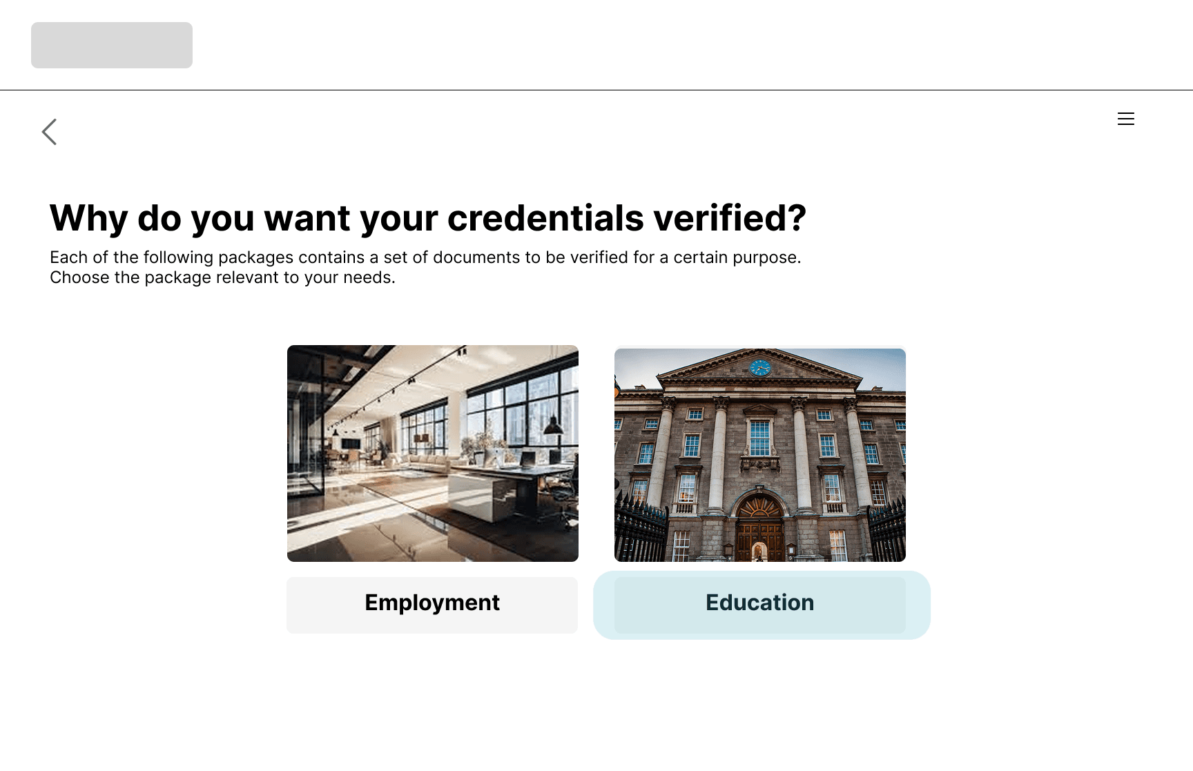


Revised Design #1
✽ A cleaner, more intuitive step-by-step experience
✽ Up-front payment to increase completion rates
✽ Customizable verification bundles

Initial Design #2
✽ Several unnecessary steps that complicated the process


Revised Design #2
✽ Fewer and clearer steps
✽ More direct pathways to task completion


The Process: Research and Exploration
Prototyping
Once the final flow was approved by all stakeholders, I created a high-fidelity prototype for developer handoff.
Check out the prototype here.
What I Learnt
Working within a fast-moving startup taught me to design for ambiguity. Frequent requirement changes meant I had to stay adaptable without losing sight of the core user problem.
My biggest takeaway from this exercise was the importance of documenting your decisions as you go, because in an evolving environment being able to explain your design decisions is as important (if not more) as the design itself.
Redesigning the MployChek Candidate Flow
Redesigning the MployChek Candidate Flow
MployChek is a company using blockchain technology to transform background verification. As part of the UX team, I redesigned one of the most critical touchpoints in the product: the self-initiated candidate flow, which is the process users follow when they independently seek credential verification for employment or education.
My Problem
The previous website used a single, generic flow for all candidates, regardless of whether they were self-initiated or recruiter-directed. User feedback revealed that this one-size-fits-all approach was causing confusion and a high drop-off rate — the flow wasn't designed with the self-initiated user's context in mind.
My Solution
I redesigned the self-initiated candidate flow to make it clear, intuitive, and aligned with evolving business requirements.
The new experience:
✽ Guides users step-by-step through the verification process
✽ Sets expectations upfront (in this case, payment)
✽ Reduces unnecessary friction and decision points
✽ Provides clearer feedback and acknowledgement
The Psychology Behind It
Background verification is, by nature, a high-stakes process. The people going through it are doing so because something important - a job, an educational opportunity - depends on the outcome. That context matters, because it means that every moment of confusion or uncertainty in the flow carries a disproportionate emotional weight.
The research reflected this clearly: a clunky interface frustrated user, yes, but also made them anxious. Designing for this experience meant keeping in mind emotional reassurance as much as task completion.
The Process: Research and Exploration
User Interviews
I conducted two moderated usability sessions over Zoom in which participants navigated the existing flow while thinking aloud. Observations were documented and synthesised to identify recurring patterns.
Key findings:
✽ Users were slowed down by misleading section headings and unclear buttons
✽ The lack of confirmation or acknowledgement made the process feel unreliable
✽ The experience often left them feeling confused, frustrated, and even anxious
This research helped me map the users' emotional journey and identify where the flow was breaking down.
Key findings:
✽ Users were slowed down by misleading section headings and unclear buttons
✽ The lack of confirmation or acknowledgement made the process feel unreliable
✽ The experience often left them feeling confused, frustrated, and even anxious
This research helped me map the users' emotional journey and identify where the flow was breaking down.
Empathy Mapping
I created two empathy maps summarising what users were thinking, feeling, saying, and doing at each stage. This helped surface the emotional dimension of the experience: specifically, the anxiety and uncertainty that came from a lack of feedback and confirmation.


Design considerations
Following a review session with the project manager, we aligned on three core design requirements:
Following a review session with the project manager, we aligned on three core design requirements:
✽ Introduce a payment step: Self-initiated candidates would now be charged for verification, so payment needed to be clearly incorporated.
✽ Introduce a payment step: Self-initiated candidates would now be charged for verification, so payment needed to be clearly incorporated.
✽ Maintain brand consistency: The new flow had to follow existing visual guidelines (fonts, colors, tone) to stay aligned with the recruiter-initiated experience.
✽ Maintain brand consistency: The new flow had to follow existing visual guidelines (fonts, colors, tone) to stay aligned with the recruiter-initiated experience.
✽ Make the process simpler and more intuitive: Reducing confusion would not only improve user experience but also decrease the load on customer support.
✽ Make the process simpler and more intuitive: Reducing confusion would not only improve user experience but also decrease the load on customer support.
User Flows
I first mapped a high-level end-to-end flow in Figma, beginning from the MployChek web app entry point. Note: my work focused on the candidate verification flow; the web app itself was designed separately.

The following diagram shows the broad steps the user will have to follow once they have finished submitting their documents and are waiting for the verification process to be complete.

Iterating on the flow
Because MployChek is an early-stage startup, business requirements shifted frequently as goals were clarified. I produced multiple iterations of the user flow in response to stakeholder feedback, treating each round as an opportunity to pressure-test assumptions.
The Process: Research and Exploration
Wireframing
The following wireframes show the iterative process: after receiving feedback from my colleagues, I refined the low and medium fidelity wireframes.
Initial Design #1
✽ Overlays that required unnecessary clicks
✽ Payment placed at the end of the flow, leading to drop-off due to perceived lack of transparency
✽ No flexibility for users to customize their verification bundle
Revised Design #1
✽ A cleaner, more intuitive step-by-step experience
✽ Up-front payment to increase completion rates
✽ Customizable verification bundles
Initial Design #2
✽ Several unnecessary steps that complicated the process
✽ User has to click on two buttons saying the same thing to get to the final screen
Revised Design #2
✽ Fewer and clearer steps
✽ More direct pathways to task completion
The Process: Research and Exploration
Prototyping
Once the final flow was approved by all stakeholders, I created a high-fidelity prototype for developer handoff.
Check out the prototype here.
What I Learnt
Working within a fast-moving startup taught me to design for ambiguity. Frequent requirement changes meant I had to stay adaptable without losing sight of the core user problem.
My biggest takeaway from this exercise was the importance of documenting your decisions as you go, because in an evolving environment being able to explain your design decisions is as important (if not more) as the design itself.